Friday, June 21, 2019

Experience of Democratic Presidential Hopefuls

Hard to believe, but there are 25 declared Democratic presidential candidates out there. How are we going to ever tell them apart?

Well, one very traditional method was to look at their experience. And here I mean political experience. Yeah, running a company or marshaling troops are great experience, they are a tad indirect. But it's just not the same.


Methodology

And by political experience, I don’t mean dog catcher or school board. I’m talking about something with some serious chops. Something at the federal level is an obvious choice. But even here there’s a big difference between VP or Senator and a clerk at the State Department or air traffic controller with the FAA. In particular, I see the following as totally legit:

  • VP
  • Cabinet secretary 
  • US Senator
  • US Rep


Now, how about something more local? Governor’s an obvious one. Not so sure about lieutenant governor though, or state senator, or anything below governor level really.


One thing I like about being governor is that it’s an executive position – i.e., it’s kind of like being the president of your own state. Same thing goes for mayors. Of course, Possum Lick, AR has a mayor, so they’re really not all equal, are they? Judgement call, right? So, Pete Buttigieg, you’re in! Wayne Messam, mayor of Miramar FL? Sorry.


Results

So, this is how it all broke out:


Notes:

  • Biden wins pretty easily.
  • Sanders is, not too surprisingly, pretty close on his heels.
  • There’s a definite group at 12 years or so.  And that group represents some definite names – Booker, Klobuchar, Gillibrand – with some definite who-dat’s as well.
  • There are no less than 9 with 6 years, including a fair amount of front runners – Buttigieg, Warren, O’Rourke. Some of the rest, though, I’d never even heard of before.
  • Kamala Harris has been in the US Senate only a year! Well, I’ll be dipped.
  • The actual nominee’s probably going to be either Andrew Yang or Marianne Williamson. I mean, it worked for Trump, right?


More Notes:

  • Only 1 candidate was in 3 or more positions - Bernie Sanders.
  • Amy Klobuchar had the most years in 1 position - 12 years as a US Senator
  • The greatest number of candidates were US senators:


  • The Senate also accounts for the most years in office - in fact, about half


Sunday, June 9, 2019

Famous Stars Who Started Out in Terrible Movies


You gotta start somewhere. C’mon, you’re a kid from Indiana, you took a Greyhound to Hollywood, you’ve got a job at TGI Friday’s ... You’re going to take whatever you can get.

And that’s especially the case if you weren’t already famous through some other route – Hollywood royalty, Broadway, TV, singer, comedian … I’m talking Julie Andrews, Carrie Fisher, Jennifer Anniston, Doris Day, Bette Midler, Will Smith, Eddie Murphy …

Now, chances are it’s not going to be a starring role either. I mean, it’s bad enough to be in Zombie Bikers from Outer Space, but if you’re also an extra, or uncredited, or 2nd barmaid, it’s gonna hurt even more. (That said, you might just be a nobody in a really good flick. Did you know, for example, that Morgan Freeman’s first role was as an extra in The Pawnbroker?)

So, who are these folks?

Methodology

  1. Looked at a couple of lists of the top 100 actors and actresses
  2. Found their first movie on IMDb (excluding shorts, videos, etc. – but more than happy to include TV movies)
  3. Saw what the ranking was, going with those that were less than 5.0 out of 10
  4. Listed them here

12  Tom Hanks

He Knows You’re Alone – 4.9

Elliot

A reluctant bride to be is stalked by a serial killer who only kills brides and the people around them. While her friends get whacked one by one, a hard boiled renegade cop whose bride had been killed years before tries to hunt him down before it is too late. Meanwhile, the bride has to figure out if it is all in her imagination or not, aided by her ex-boyfriend.

"Every girl is frightened the night before her wedding, but this time... there's good reason!"


11 Tom Cruise

Endless Love – 4.8

Billy

Two young teenagers, Jade Butterfield and David Axelrod, fall in love with each other. But the passion is too consuming for Jade's bohemian parents. Her parents try to stop them from seeing each other. But when this doesn't work, David burns down the house and is sent to a mental hospital. This doesn't stop him from seeing her. When he gets out, he goes to look for her and remains in love with her. But in the end, the passion for his first love is too strong and she has to leave or this love will kill both of them.

"She is 15. He is 17. The love every parent fears."


10 Joe Pesci

Hey, Let’s Twist! – 4.8

Dancer at the Peppermint Club (uncredited)

The rise, fall and rise again of the Peppermint Lounge nightclub is chronicled. The sons of the Peppermint Lounge nightclub owner nearly topple the club's initial success by redesigning the place but realize their mistake.

"The Exciting Movie About THE Sensation!"


9 Paul Newman

The Silver Chalice – 4.7

Basil

A Greek artisan is commissioned to cast the cup of Christ in silver, and sculpt around its rim, the faces of the disciples and Jesus. He travels to Jerusalem and eventually to Rome to complete the task. Meanwhile, a nefarious interloper is trying to convince the crowds that he is the new Messiah, by using nothing more than cheap parlor tricks.

"I bid you seek the lost Silver Cup... for Sin is rising like the swollen rivers..."


8 Demi Moore


Choices – 4.7

Corri

Partially deaf teenager Carafotes becomes alienated when prevented from playing football because of his handicap. He must deal with his parents, coach, teammates, his new girlfriend and a bad crowd he almost falls into, before confronting the school board.

"Youth won't always take no for an answer!"


7 Leonardo Di Caprio

Critters 3 – 4.3

Josh

In what appears to be a cross between Critters and The Towering Inferno, the residents of a shoddy L.A. apartment block are chased up to the roof by hoards of the eponymous hairy horrors.

"You are what they eat"


6 Robin Williams

Can I Do It Until I Need Glasses? – 4.3

Lawyer / Man with Toothache

A comedy comprised of short sexually suggestive skits

"It's the nuttiest, naughtiest, looniest, gooniest, funniest madcap comedy of the year!"

Actually a year or two before

5 Charlize Theron

Children of the Corn III: Urban Harvest – 4.1

Eli’s Follower (uncredited)

Two young Gatlin residents are orphaned after the younger brother kills their father. So, the terror of Gatlin goes urban when the two boys are placed in the custody of two foster parents. The younger brother (who by this point is established as the "evil one") bought some corn seeds along for the road and plants them in the courtyard of an abandoned warehouse, bring He Who Walks Behind the Rows to the city. He winds up possessing his high school peers, and soon his older brother feels called to stop him.

"An Adult Nightmare is about to show its face in the heart of a city!"


4 George Clooney

Grizzly II: The Concert – 3.8

Ron

All hell breaks loose when a giant Grizzly, reacting to the slaughter of Grizzlies by poachers, attacks at a massive big-band rock concert in the National Park.

"The Stage Is Set... And The Dinner Is Served."


3 Julia Roberts

Firehouse – 3.1

Babs (uncredited)

Some sexy women get out of Fire Fighter School and go for the jobs they trained for, but first they must survive their male counterparts teasing them.

"When the fire's out...the heat is on"


2 Sandra Bullock

Hangmen – 3.0

Lisa Edwards

Danny Greene is just like every sixteen-year-old kid...except that a secret splinter group of the CIA wants him dead. Danny Greene is running for his life. Enter Danny's father, an ex-Greene Beret equipped with a rag-tag bunch of urban guerillas and an entire arsenal of weaponry. But can five former commandos defeat the largest, most thorough network of government-sanction assassins in the world? In this high-stakes world, before the case even gets to trial, someone's already called the Hangmen.

"In this world no one is innocent, and if you want to live, you've got to beat the Hangmen."

Yup, that's a kaffeya

1 Harrison Ford

Malibu Hot Summer – 2.5

John Logan

John Logan is a poor little rich boy. He learns to love from three nubile L.A. newcomers that will do anything to be introduced into the sizzling nightlife of the City of Angels. Portraying the Malibu beach life by day, and the L.A. club life by night, Sizzle Beach U.S.A. is a stunning insiders critique on the sex and drug lifestyle of the West Coast swinger scene in the early 80s.

"Hot sand! Hot bodies! Hot Costner!"


Friday, May 24, 2019

Best/Worst MLB Uniforms - AL

Baltimore


Good


1966-1974 (more or less)

Classic example of a two-color uni. Notice how well the two colors (and two only please) complement each other.

It also synchs pretty well with the Orioles’ heyday. I’m talking Brooks Robinson, Frank Robinson, Boog Powell, Dave McNally, Jim Palmer, Mike Cuellar ... My family lived there during the time, and the O’s were the first team I cheered for. Heck, I even remember the backup catcher from those lineups (Clay Dalrymple, if you must ask). 

BTW, this is not all that different from the uniforms the team wore for the previous ten years. That one, though, had the full bird logo on the hat, one of the lamer logos there’s ever been. Oddly, they would return to that in 1989, reverting back to the cartoon bird only in 2012.

Bad

1971-1972

Okay, so how did this one sneak in here?  Well, as you can see, this is basically the good uniforms with that horrible orange thing thrown in. The O’s would feature orange tops for a number of years, but never the whole shebang again. And we can all be thankful for that.

Boston


Good

1934-2019

85 years? Wow! They must be doing something right.

Indeed, the simplicity, the old-fashioned lettering, the nice interplay between the two colors … Yup, it just so happens to also be the uniform that Teddy Ballgame, Yaz, Pudge, Big Papi, and all the rest wore as well.

As a certified member of Red Sox Nation (hey, I married into it), I can confidently say, “I approve this uniform.”


Bad

1912-1920

Had to go back a ways for this one. Honestly, though, has there ever been a more boring uniform than that home one? At least the road version lets you know who you’re playing against. I do like those red socks, but honestly guys, you’re going to have to be a little less subtle than that.


White Sox


Good

1982-1986

So, I do usually go for the classics. For the White Sox, though, we’ve got two mitigating factors to deal with here. One, though they did have some good classic unis, they tended to be a little boring, plus they never really stuck with anything that long. Two, this one is actually pretty cool.

Yeah, I know this is straight from the era of excess, but you know, it actually works. It’s not too over the top, the combo of colors is pretty effective, and there is some definite visual interest. This also goes to show that I’m not just an old stick in the mud as well.


Bad

1976-1981 (thereabouts)

Of course, the White Sox were also quite capable of striking out looking with the bases loaded in the bottom of the ninth with two outs and down a run as well.

I couldn’t find a set that actually included shorts, but a little research on the Interwebs tells me that that did indeed happen – in 1976, and only for a single game. And that probably gets my vote for worst uniform ever.

By the way, that all-black number was a genuine throwback. The team wore something similar up to 1916. Musta been nice and comfy in wool.


Cleveland


Good

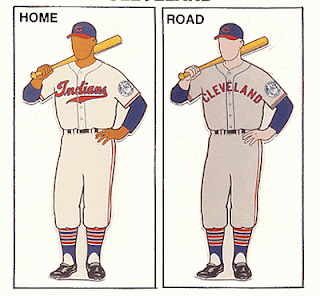
1946-1950

The Indians sure have tried a bunch of different looks over the years. This is the closest I could get to a classic look that also had a little visual interest as well. A lot of their earlier stuff was very basic and uninteresting. And, for some reason, they immediately reverted to that look right after these.


Bad

1975-1977

You probably know how I feel about solid-color unis at this point. This one, though, may be the worst. If you can find some live shots of these on the Web, they actually look a lot darker – almost burgundy. Thankfully, this only lasted a couple of years.

Another thing that turned me off with these was the lettering. I’m sure it was supposed to reflect Native Americans culture somehow, but it always looked like it came straight out of the Flintstones for me. 


Detroit


Good

1934-2019

Another 85-year-old! This one’s a little different though. It’s super simple, but with one very distinct, defining element – that Gothic D. The whole thing just says Tigers to me. Another real classic.


Bad

1903

Once again, some of those old-timey uniforms were just a little too simple. Basically, we’ve got a big, unadorned D with some differently colored socks and little flash of color on the bill of the home cap. Thank goodness this only lasted a year.


Houston


Good

1965-1970

It’s a tad on the dull side. But considering who we’re talking about here, that is definitely a good thing. They would shake off any sense of nuance or subtlety tout suite.


Bad

1975-1986


These are kind of like an Ed Wood movie – you know, so bad they’re good. There’s probably no better representative of the excesses of the ‘70s and ‘80s than this baby. What were they thinking? Where do I even begin?


Kansas City


Good

1969-1970, 2006-2019


What’s so curious about these are why the team ditched them so soon. Yeah, they’re a tad boring, but they’re pretty classic as well. 

Also, they were the only team at this time who went with that lighter shade of blue. It became something of a signature color for them. Of course, the unis for the next two years were pretty darn similar (the only difference was block letters on the road version). And for the next 30 or so years, the home outfit stayed the same. It was those baby blue away ones that spoiled everything.


Bad

2003-2005

Now, this is not bad at all. It fits in with the overall history, and certainly doesn’t have anything crazy or objectionable about it. All you’ve really got is the cutoff sleeves. Bear with me, though – I had to pick something.


Los Angeles Angels


Good

1965-1970

There was certainly nothing wrong with what followed this (and which lasted for over 20 years). I just think this one has more of a classic look. It would, in fact, be very similar to what the Angels would return to in 1992 (though only for four years). Personally, I always loved the little white stripe around the top of the cap.


Bad

1997-2001

And that’s when they came up with these. To me, it’s just a little too much. Pin stripes? Check. Cut-off sleeves? Got it. Gaudy logo across the chest? Right. Logo repeated on the hat, making it look very minor league? Right.


Minnesota


Good

1961-1975, 1987-2019

Here’s another super-classy, extremely long-lived beauty.  Subtle, nice use of pin stripes – what more can I say? They certainly check all the boxes. 

Wondering what happened in those 10 years in the middle? Honestly, all they did was go with a knit look and no pin stripes, and make the crowns on the home caps red. And that’s why I don’t have a bad uniform for these guys.


New York Yankees


Good

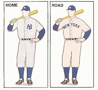
1936-2019

So, here’s another one of those 85-year-olds classics. Something must have been in the air back then.

Hating the Evil Empire as much as I do, I have to – very reluctantly – admit this is probably the best uniform ever. 


Bad

1910

Well, I do recognize the logo on the sleeve. The other stuff is just plain weird, or simply doesn’t fit.


Oakland


Good

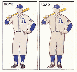
1943-1950

No, this was not an Oakland team. Instead, this one dates all the way back to when the A’s were in Philadelphia.

It is very simple, but that may be actually one of its strengths. I also like the classic Gothic A, something that goes back to the team’s second year, way back in 1902. Finally, that shade of blue is pretty unique. Teams tend to go with either a darker or lighter version. Overall, it’s simple, but without being plain at all. Good job.


Bad


1973

Thanks, Charlie Finley. Yup, the guy who brought us orange-colored baseballs, a mule mascot, sheep in the outfield, a designated runner, and the designated hitter also brought us these abominations. 

Color rush unis are bad enough. Yellow and green, though, seem like particularly ill-suited for that treatment.


Seattle


Good

1995-2019

Simple, subtle, but with some visual interest in the unusual (and very Pacific Northwest) colors of green and blue. Honestly, though, these guys really don’t have anything all that exciting.


Bad

1981-1984

It’s really not that offensive, but it’ll have to do. I’m dinging ‘em for the blue roadies, the rather over-done script, and all that stripyness. 

Tampa


Good

2008-2019

Once again, it’s not all that great. But, then again, it’s not all that bad. Honestly, I think that’s all I got to say here.


Bad

1998-2000

This, however, is genuinely bad.  In fact, I’m not sure this illustration does it justice. The major offender, of course, is the color gradient – from blue to yellow – on the very large lettering. It’s just kind of a cheesy touch that was fairly outdated even in 1998. It’s hard to see here, but that treatment extends to the cap as well:

Texas


Good

2000

One thing that’s always struck me about the fans at Rangers game is that half of them are in blue, and half of them are in red. And I think the set above does a good job reflecting that. In fact, I can’t think of another team that has totally different colors for home and away like these. And that’s what makes these interesting, though they are definitely no classics. More like the best of a bad – or mediocre – bunch. 


Bad

1976-1982

Once again, these are not that bad. It’s a different – but effective – treatment for the red and blue. I guess the two things that I’m really dinging ‘em for here are the powder blue road unis and that old-timey font. As for the latter, I do give ‘em some credit for trying, but they come off a slightly cheesy. 


Toronto


Good

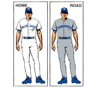
2013-2019

I’m starting to sound like a broken record … Once again, a team has gone with something fairly simple, and has managed to – at the very least – not offend.


Bad

1987

These, on the other hand, do manage to offend. First, you’ve got that beer-league softball cap. Next, you’ve got your powder blue road kit. 

And, finally, there’s that big logo on the jerseys. Now, there’s nothing inherently wrong with that. It’s just something that’s not typically done. And, personally, I do think it adds a little more beer-league flavor to the whole ensemble.