Arizona
Good

2007-2014
These guys haven’t really been around long enough, but they have tried a number of different looks. For me, this is the best of a fairly uninspiring bunch. It’s got simplicity going for it, as well as a little bit of interest in the lettering. Personally, I also prefer that logo to the weird A they‘ve also sported (and still have today).
Bad

1998-2000
But, what’s with the teal on the hat? Over on the right. Under “Road.” Yup, that was another popular color back from those days way back then. Not sure when – or why – they would have worn those. It doesn’t exactly go with the rest of the ensemble.
Add some pin stripes, the over-busy lettering, and the lack of color contrast between the hat logo and background, and we’ve got a real disaster on our hands.
Atlanta
Good

1966-1967, 1987-1994
A real classic. Used in Milwaukee with just a few minor changes (and in Boston all the way back to 1946), this design very effectively brings back the Golden Age of baseball. Atlanta was actually one of the first teams to return to an older, retro look, in the late 80s. They’ve also used the same style to the present day, by the way, but with a darker road uniform.
Hard to believe, but Spahn, Matthews, Aaron, Glavine, Smoltz, Maddux, and Chipper Jones all basically wore the same basic outfit.
Bad

1976-1979
Cubs
Good
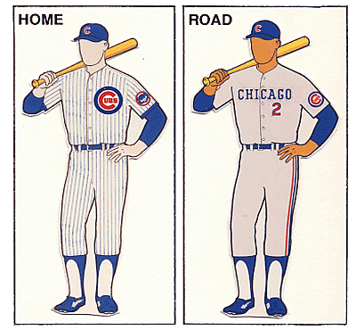
1990-1993, 2001-2019
(1958-1975)
Note that the years in parens are almost the same, but with a few little minor differences. Heck, even the other years in that whole time span weren’t all that different, and really just ring the changes on the same basic pattern.
Bad

1918
Wow! Where did those come from? Pink is not a color you see on baseball uniforms very often (unless you’re talking about the All-American Girls Professional Baseball League).
Also, maybe my eyes are deceiving me, but does that guy on the right have green socks? Pink and green might go together on Martha’s Vineyard or Nantucket, but definitely not on a major league baseball field
Finally, the logo on the road jersey looks more like “UBS” than “Cubs” to me. I guess that would make them the company team for the Swiss banking giants then.
Cincinnati
Good

1968-1992, 2007-2015
Note that this includes their famous polyester version, which they rocked from 1972 to 1992. The only difference was a red collar and belt with double stripes. Those are also the uniforms that Bench, Robinson, Rose, Perez, and all the rest of the Big Red Machine.
I really like the simplicity here, especially relative to color. And seeing as the team is called the “Reds” …
Bad

1936
The red pants are enough all by themselves, but I do also have to give them (negative) credit for their indecisiveness (are we red, are we blue, are we red-white-and-blue?). Finally, I can’t decide what I dislike the most – that rather busy logo on the shirt, or the teeny, tiny “Reds.” Nothing can top those red pants though.
Colorado
Good / Bad

1993-2019
Los Angeles Dodgers
Good

1959-2019
Hey, if it ain’t broke … One of the all-time classics, this baby hasn’t changed since the Dodgers moved to LA, about 60 years ago. It’s also basically the same as the Brooklyn Dodgers wore from 1952 to 1958, and from 1938 with a few minor changes. Robinson, Koufax, Drysdale, Lasorda, Sutton, Kershaw …
Simplicity is a plus here, but there are also a few details that really help distinguish these as well. First is the red numbering, a small detail that just screams “Dodgers.” Second is the script. No one else has really done that as well. Finally, the logo on the cap is probably the best one out there.
Bad

1916
Checks? Checks??? Honestly, is this supposed to be gingham?
Miami
Good

2012-2019
Another team that hasn’t been around that long, the Marlins really don’t have all that much difference between the good and the bad. That said, I really like that color combo. It’s super different, but is nicely underplayed and also makes a nice tie-in to the city (and its Art Deco heritage). It also looks pretty good on the cap logo as well.
Bad

1995-1996
Yup, this one isn’t all that different. And, honestly, all I can really ding ‘em for is the teal on the road caps. There are some good two-color caps out there, but probably not this one. For one thing, I’ve noticed that the more successful of these tend to have the darker color on top.
To be honest, though, that’s just a quibble. These really aren’t that bad. Pretty much totally forgettable, but definitely not the stuff of nightmares.
Milwaukee
Good

1986-1989
Pretty distinctive (unlike their current unis), but still very much in the realm of good taste. And that’s not something you can say of all Brewer uniforms. I always thought that little logo on their cap was pretty clever (and, once again, a lot more interesting than what they have today).
1990 to 1993 were almost identical, with script instead of block letters on the home jersey.
Bad

1995-1996
I was so wanting to put in the two-tone cap and the very blue road uniforms of the 70s and 80s, but this color combo is just so off. Were they channeling the Mariners? And that logo! Usually, I like those intertwined letters (SF, NY, StL …), but this is just kind of a blob.
New York Mets
Good

1961-2019
Hard to believe, but these guys have had only one uniform in their almost-60 years. And it really is a beaut. Nice and simple, but also doing something really interesting with New York baseball history.
When the Giants and Dodgers left New York in the late 50s, the city was crushed. When the Mets were born a few years later, they combined Dodger blue with the Giants’ orange, logo, and road lettering.
Hard to believe that Stengel, Seaver, Strawberry, Piazza, David Wright, and Jacob deGrom have all worn the same outfit.
Philadelphia
Good

1950-1969, 1992-2019
Nice and simple, with plenty of history behind it. Heck, Grover Cleveland Alexander wore something not all that different over 100 years ago.
In particular, I like the color (especially those little blue dots), the script (repeated on both shirt and cap), and the pinstripes. As for that last bit, I’ve always felt that pinstripes work best with just a single color. You know, like the Yankees?
Bad

1979
Single-color uniforms have a long history in soccer, and are making something of a splash in American football as well. They do not belong on a baseball diamond.
That said, the first uniform is not bad at all. I really like that logo as well. As for the away version, it’s a good example of some of the horrible baby blue stuff teams were wearing in the ’70 and ‘80s when they were on the road. Kansas City, Toronto, and the Expos are all liable here, but I think it clashed in particular with the Phillies’ red.
Pittsburgh
Good

1970-1975
Hard to believe, but this one dates back to the era of the cookie cutter stadiums. Surprisingly, a couple of other decent uniforms date from that era as well. I’ve already mentioned the Reds, but there were several others than made that polyester work – St. Louis, Minnesota, even the Indians.
For me, I always saw it as the perfect treatment of a two-color scheme. First, there’s that great hat. Then, though, you’ve got those cool stripes repeated at the arms, waist, and ankles.
I may, though, be a little biased here … My family moved to Pittsburgh when I was a pre-teen around this time. With Maz, Stargell, and of course Roberto, it was definitely a team – and a uniform – you could bond for life with. And I did.
Bad

1977-1979
And then they went to this stuff … What were they thinking? I’ve never seen such a mishmash of styles. From the ol’ timey cap, to the pinstripes, to the solid colors … We used to call them the “bumblebees” and the “canaries.”
St. Louis
Good

1965-1975, 1985-1991, 2013-2019
This is just such a classic that it makes you wonder what they wore before 1965, between ‘75 and ‘85, and in the early years of this century. To be honest, the differences weren’t all that great.
The thing with the birds and bat actually goes all the way back to 1922. And those great interlocking letters on the cap go all the way back to 1941. Of course, they were also on a black background until ’65. That was the year that they finally stopped toying around with that second color and committed full-time to red.
Bad

1907-1917
Well, there’s certainly nothing garish about this one. In fact, my main issue here is is it’s just so boring. I’m honestly not sure there’s anything else out there that’s so plain.
San Diego
Good

1985-1990
The Pads went to an all-blue uni in 1991, reflecting the naval history of the city as well as the uniforms of the old minor league team. Tell you the truth, I think those minor league outfits beat anything the Padres later came up with.
Bad

1978
The colors, that cap, the lettering, the all-yellow ensemble … I don’t know, this might be the worst ever.
San Francisco
Good

1958-2019
Much like the Dodgers, the Giants headed West, kept their basic outfit, and never changed it. And that basic outfit dates all the way back to 1933.
Bad

1916
Was this a New York thing? I already shared Brooklyn’s brush with gingham and mismatched colors. I gotta tell you, though, that road uni looks like pajamas.
Washington
Good

2011-2019
Having grown up a Senators fan (me and probably 3 other guys), I was super-excited to see baseball return to DC. Even more so, though, I loved that they finally resurrected those old uniforms.
They're nice and simple, and I love that W. Also, the road uni has just enough difference to make it interesting.
Bad

1908
Are you hot yet? Considering these things were probably all wool, and knowing how hot and sticky summers can be in DC, my heart goes out to these guys. And that includes rookie Walter Johnston. Luckily, he would wear a much lighter uni for the rest of his career here.
Next week, the AL.
No comments:
Post a Comment