Baltimore
Good

1966-1974 (more or less)
Classic example of a two-color uni. Notice how well the two colors (and two only please) complement each other.
It also synchs pretty well with the Orioles’ heyday. I’m talking Brooks Robinson, Frank Robinson, Boog Powell, Dave McNally, Jim Palmer, Mike Cuellar ... My family lived there during the time, and the O’s were the first team I cheered for. Heck, I even remember the backup catcher from those lineups (Clay Dalrymple, if you must ask).
BTW, this is not all that different from the uniforms the team wore for the previous ten years. That one, though, had the full bird logo on the hat, one of the lamer logos there’s ever been. Oddly, they would return to that in 1989, reverting back to the cartoon bird only in 2012.

Bad

1971-1972
Okay, so how did this one sneak in here? Well, as you can see, this is basically the good uniforms with that horrible orange thing thrown in. The O’s would feature orange tops for a number of years, but never the whole shebang again. And we can all be thankful for that.
Boston
Good

1934-2019
85 years? Wow! They must be doing something right.
Indeed, the simplicity, the old-fashioned lettering, the nice interplay between the two colors … Yup, it just so happens to also be the uniform that Teddy Ballgame, Yaz, Pudge, Big Papi, and all the rest wore as well.
As a certified member of Red Sox Nation (hey, I married into it), I can confidently say, “I approve this uniform.”
Bad

1912-1920
Had to go back a ways for this one. Honestly, though, has there ever been a more boring uniform than that home one? At least the road version lets you know who you’re playing against. I do like those red socks, but honestly guys, you’re going to have to be a little less subtle than that.
White Sox
Good

1982-1986
So, I do usually go for the classics. For the White Sox, though, we’ve got two mitigating factors to deal with here. One, though they did have some good classic unis, they tended to be a little boring, plus they never really stuck with anything that long. Two, this one is actually pretty cool.
Yeah, I know this is straight from the era of excess, but you know, it actually works. It’s not too over the top, the combo of colors is pretty effective, and there is some definite visual interest. This also goes to show that I’m not just an old stick in the mud as well.
Bad

1976-1981 (thereabouts)
Of course, the White Sox were also quite capable of striking out looking with the bases loaded in the bottom of the ninth with two outs and down a run as well.
I couldn’t find a set that actually included shorts, but a little research on the Interwebs tells me that that did indeed happen – in 1976, and only for a single game. And that probably gets my vote for worst uniform ever.
By the way, that all-black number was a genuine throwback. The team wore something similar up to 1916. Musta been nice and comfy in wool.
Cleveland
Good
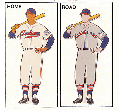
1946-1950
The Indians sure have tried a bunch of different looks over the years. This is the closest I could get to a classic look that also had a little visual interest as well. A lot of their earlier stuff was very basic and uninteresting. And, for some reason, they immediately reverted to that look right after these.
Bad

1975-1977
You probably know how I feel about solid-color unis at this point. This one, though, may be the worst. If you can find some live shots of these on the Web, they actually look a lot darker – almost burgundy. Thankfully, this only lasted a couple of years.
Another thing that turned me off with these was the lettering. I’m sure it was supposed to reflect Native Americans culture somehow, but it always looked like it came straight out of the Flintstones for me.
Detroit
Good

1934-2019
Another 85-year-old! This one’s a little different though. It’s super simple, but with one very distinct, defining element – that Gothic D. The whole thing just says Tigers to me. Another real classic.
Bad

1903
Once again, some of those old-timey uniforms were just a little too simple. Basically, we’ve got a big, unadorned D with some differently colored socks and little flash of color on the bill of the home cap. Thank goodness this only lasted a year.
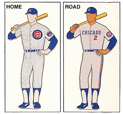
Houston
Good

1965-1970
It’s a tad on the dull side. But considering who we’re talking about here, that is definitely a good thing. They would shake off any sense of nuance or subtlety tout suite.
Bad

1975-1986
These are kind of like an Ed Wood movie – you know, so bad they’re good. There’s probably no better representative of the excesses of the ‘70s and ‘80s than this baby. What were they thinking? Where do I even begin?
Kansas City
Good

1969-1970, 2006-2019
What’s so curious about these are why the team ditched them so soon. Yeah, they’re a tad boring, but they’re pretty classic as well.
Also, they were the only team at this time who went with that lighter shade of blue. It became something of a signature color for them. Of course, the unis for the next two years were pretty darn similar (the only difference was block letters on the road version). And for the next 30 or so years, the home outfit stayed the same. It was those baby blue away ones that spoiled everything.
Bad

2003-2005
Now, this is not bad at all. It fits in with the overall history, and certainly doesn’t have anything crazy or objectionable about it. All you’ve really got is the cutoff sleeves. Bear with me, though – I had to pick something.
Los Angeles Angels
Good

1965-1970
There was certainly nothing wrong with what followed this (and which lasted for over 20 years). I just think this one has more of a classic look. It would, in fact, be very similar to what the Angels would return to in 1992 (though only for four years). Personally, I always loved the little white stripe around the top of the cap.
Bad

1997-2001
And that’s when they came up with these. To me, it’s just a little too much. Pin stripes? Check. Cut-off sleeves? Got it. Gaudy logo across the chest? Right. Logo repeated on the hat, making it look very minor league? Right.
Minnesota
Good

1961-1975, 1987-2019
Here’s another super-classy, extremely long-lived beauty. Subtle, nice use of pin stripes – what more can I say? They certainly check all the boxes.
Wondering what happened in those 10 years in the middle? Honestly, all they did was go with a knit look and no pin stripes, and make the crowns on the home caps red. And that’s why I don’t have a bad uniform for these guys.
New York Yankees
Good

1936-2019
So, here’s another one of those 85-year-olds classics. Something must have been in the air back then.
Hating the Evil Empire as much as I do, I have to – very reluctantly – admit this is probably the best uniform ever.
Bad

1910
Oakland
Good
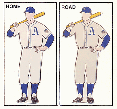
1943-1950
No, this was not an Oakland team. Instead, this one dates all the way back to when the A’s were in Philadelphia.
It is very simple, but that may be actually one of its strengths. I also like the classic Gothic A, something that goes back to the team’s second year, way back in 1902. Finally, that shade of blue is pretty unique. Teams tend to go with either a darker or lighter version. Overall, it’s simple, but without being plain at all. Good job.
Bad

1973
Thanks, Charlie Finley. Yup, the guy who brought us orange-colored baseballs, a mule mascot, sheep in the outfield, a designated runner, and the designated hitter also brought us these abominations.
Color rush unis are bad enough. Yellow and green, though, seem like particularly ill-suited for that treatment.
Seattle
Good

1995-2019
Simple, subtle, but with some visual interest in the unusual (and very Pacific Northwest) colors of green and blue. Honestly, though, these guys really don’t have anything all that exciting.
Bad

1981-1984
Tampa
Good

2008-2019
Once again, it’s not all that great. But, then again, it’s not all that bad. Honestly, I think that’s all I got to say here.
Bad

1998-2000
This, however, is genuinely bad. In fact, I’m not sure this illustration does it justice. The major offender, of course, is the color gradient – from blue to yellow – on the very large lettering. It’s just kind of a cheesy touch that was fairly outdated even in 1998. It’s hard to see here, but that treatment extends to the cap as well:

Texas
Good

2000
One thing that’s always struck me about the fans at Rangers game is that half of them are in blue, and half of them are in red. And I think the set above does a good job reflecting that. In fact, I can’t think of another team that has totally different colors for home and away like these. And that’s what makes these interesting, though they are definitely no classics. More like the best of a bad – or mediocre – bunch.
Bad

1976-1982
Once again, these are not that bad. It’s a different – but effective – treatment for the red and blue. I guess the two things that I’m really dinging ‘em for here are the powder blue road unis and that old-timey font. As for the latter, I do give ‘em some credit for trying, but they come off a slightly cheesy.
Toronto
Good
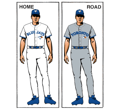
2013-2019
I’m starting to sound like a broken record … Once again, a team has gone with something fairly simple, and has managed to – at the very least – not offend.
Bad

1987
These, on the other hand, do manage to offend. First, you’ve got that beer-league softball cap. Next, you’ve got your powder blue road kit.
And, finally, there’s that big logo on the jerseys. Now, there’s nothing inherently wrong with that. It’s just something that’s not typically done. And, personally, I do think it adds a little more beer-league flavor to the whole ensemble.