Sunday, April 21, 2019

Best/Worst MLB uniforms - NL

Arizona


Good

2007-2014

These guys haven’t really been around long enough, but they have tried a number of different looks. For me, this is the best of a fairly uninspiring bunch. It’s got simplicity going for it, as well as a little bit of interest in the lettering. Personally, I also prefer that logo to the weird A they‘ve also sported (and still have today).


Bad

1998-2000

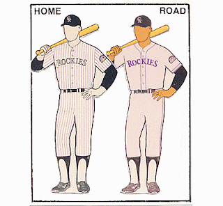
Purple. Yup, purple. It was a very popular color back in the day. It was popular with the Rockies, and the Ravens, and the Suns, and the Diamond Backs. 

But, what’s with the teal on the hat? Over on the right. Under “Road.” Yup, that was another popular color back from those days way back then. Not sure when – or why – they would have worn those. It doesn’t exactly go with the rest of the ensemble.

Add some pin stripes, the over-busy lettering, and the lack of color contrast between the hat logo and background, and we’ve got a real disaster on our hands.


Atlanta


Good

1966-1967, 1987-1994

A real classic. Used in Milwaukee with just a few minor changes (and in Boston all the way back to 1946), this design very effectively brings back the Golden Age of baseball. Atlanta was actually one of the first teams to return to an older, retro look, in the late 80s. They’ve also used the same style to the present day, by the way, but with a darker road uniform. 
Hard to believe, but Spahn, Matthews, Aaron, Glavine, Smoltz, Maddux, and Chipper Jones all basically wore the same basic outfit.


Bad

1976-1979

Where do I begin? You’ve got your gratuitous pinstripes (they’ve really only looked good on a handful of teams over the years), that weird little thing on the sleeve, and what is perhaps the ultimate beer league softball hat. At least Hank Aaron was spared playing in these (though those Brewer unis were not all that much better).


Cubs


Good

1990-1993, 2001-2019
(1958-1975)

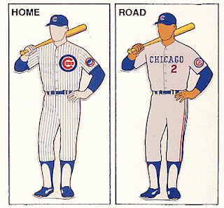
Another real classic. Nice and simple, but with a few details – the pin stripes, the interesting logo on the home uniform, and the cute little cub on the sleeve – that make the whole pretty unique at the same time.

Note that the years in parens are almost the same, but with a few little minor differences. Heck, even the other years in that whole time span weren’t all that different, and really just ring the changes on the same basic pattern. 


Bad

1918

Wow! Where did those come from? Pink is not a color you see on baseball uniforms very often (unless you’re talking about the All-American Girls Professional Baseball League). 

Also, maybe my eyes are deceiving me, but does that guy on the right have green socks? Pink and green might go together on Martha’s Vineyard or Nantucket, but definitely not on a major league baseball field

Finally, the logo on the road jersey looks more like “UBS” than “Cubs” to me. I guess that would make them the company team for the Swiss banking giants then. 


Cincinnati


Good

1968-1992, 2007-2015

Note that this includes their famous polyester version, which they rocked from 1972 to 1992. The only difference was a red collar and belt with double stripes. Those are also the uniforms that Bench, Robinson, Rose, Perez, and all the rest of the Big Red Machine. 

I really like the simplicity here, especially relative to color. And seeing as the team is called the “Reds” …


Bad

1936

The red pants are enough all by themselves, but I do also have to give them (negative) credit for their indecisiveness (are we red, are we blue, are we red-white-and-blue?). Finally, I can’t decide what I dislike the most – that rather busy logo on the shirt, or the teeny, tiny “Reds.” Nothing can top those red pants though.


Colorado


Good / Bad

1993-2019

Well, let’s give ‘em credit. They’ve only been around 30-some years, but they’ve kept the same uniform for the whole time. Further, it’s admirably simple, even though one of their colors is the rather garish purple. And we all know what Arizona did with that color.


Los Angeles Dodgers


Good

1959-2019

Hey, if it ain’t broke … One of the all-time classics, this baby hasn’t changed since the Dodgers moved to LA, about 60 years ago. It’s also basically the same as the Brooklyn Dodgers wore from 1952 to 1958, and from 1938 with a few minor changes. Robinson, Koufax, Drysdale, Lasorda, Sutton, Kershaw …

Simplicity is a plus here, but there are also a few details that really help distinguish these as well. First is the red numbering, a small detail that just screams “Dodgers.” Second is the script. No one else has really done that as well. Finally, the logo on the cap is probably the best one out there.


Bad

1916

Checks? Checks??? Honestly, is this supposed to be gingham? 


Miami


Good

2012-2019

Another team that hasn’t been around that long, the Marlins really don’t have all that much difference between the good and the bad. That said, I really like that color combo. It’s super different, but is nicely underplayed and also makes a nice tie-in to the city (and its Art Deco heritage). It also looks pretty good on the cap logo as well.


Bad

1995-1996

Yup, this one isn’t all that different. And, honestly, all I can really ding ‘em for is the teal on the road caps. There are some good two-color caps out there, but probably not this one. For one thing, I’ve noticed that the more successful of these tend to have the darker color on top. 

To be honest, though, that’s just a quibble. These really aren’t that bad. Pretty much totally forgettable, but definitely not the stuff of nightmares.


Milwaukee


Good

1986-1989


Pretty distinctive (unlike their current unis), but still very much in the realm of good taste. And that’s not something you can say of all Brewer uniforms. I always thought that little logo on their cap was pretty clever (and, once again, a lot more interesting than what they have today). 

1990 to 1993 were almost identical, with script instead of block letters on the home jersey. 


Bad

1995-1996

I was so wanting to put in the two-tone cap and the very blue road uniforms of the 70s and 80s, but this color combo is just so off. Were they channeling the Mariners? And that logo! Usually, I like those intertwined letters (SF, NY, StL …), but this is just kind of a blob.


New York Mets


Good

1961-2019


Hard to believe, but these guys have had only one uniform in their almost-60 years. And it really is a beaut. Nice and simple, but also doing something really interesting with New York baseball history. 

When the Giants and Dodgers left New York in the late 50s, the city was crushed. When the Mets were born a few years later, they combined Dodger blue with the Giants’ orange, logo, and road lettering. 

Hard to believe that Stengel, Seaver, Strawberry, Piazza, David Wright, and Jacob deGrom have all worn the same outfit.  


Philadelphia


Good

1950-1969, 1992-2019


Nice and simple, with plenty of history behind it. Heck, Grover Cleveland Alexander wore something not all that different over 100 years ago. 

In particular, I like the color (especially those little blue dots), the script (repeated on both shirt and cap), and the pinstripes. As for that last bit, I’ve always felt that pinstripes work best with just a single color. You know, like the Yankees?


Bad

1979


Single-color uniforms have a long history in soccer, and are making something of a splash in American football as well. They do not belong on a baseball diamond.

That said, the first uniform is not bad at all. I really like that logo as well. As for the away version, it’s a good example of some of the horrible baby blue stuff teams were wearing in the ’70 and ‘80s when they were on the road. Kansas City, Toronto, and the Expos are all liable here, but I think it clashed in particular with the Phillies’ red. 


Pittsburgh


Good

1970-1975


Hard to believe, but this one dates back to the era of the cookie cutter stadiums. Surprisingly, a couple of other decent uniforms date from that era as well. I’ve already mentioned the Reds, but there were several others than made that polyester work – St. Louis, Minnesota, even the Indians.

For me, I always saw it as the perfect treatment of a two-color scheme. First, there’s that great hat. Then, though, you’ve got those cool stripes repeated at the arms, waist, and ankles. 

I may, though, be a little biased here … My family moved to Pittsburgh when I was a pre-teen around this time. With Maz, Stargell, and of course Roberto, it was definitely a team – and a uniform – you could bond for life with. And I did.


Bad

1977-1979


And then they went to this stuff … What were they thinking? I’ve never seen such a mishmash of styles. From the ol’ timey cap, to the pinstripes, to the solid colors … We used to call them the “bumblebees” and the “canaries.” 


St. Louis


Good

1965-1975, 1985-1991, 2013-2019


This is just such a classic that it makes you wonder what they wore before 1965, between ‘75 and ‘85, and in the early years of this century. To be honest, the differences weren’t all that great. 

The thing with the birds and bat actually goes all the way back to 1922. And those great interlocking letters on the cap go all the way back to 1941. Of course, they were also on a black background until ’65. That was the year that they finally stopped toying around with that second color and committed full-time to red.


Bad

1907-1917


Well, there’s certainly nothing garish about this one. In fact, my main issue here is is it’s just so boring. I’m honestly not sure there’s anything else out there that’s so plain.


San Diego


Good

1985-1990

For the Padres, this one’s pretty simple. The pinstripes, the interesting lettering on the home jersey, and the logo on the road jersey, though, all make this just different enough. 

The Pads went to an all-blue uni in 1991, reflecting the naval history of the city as well as the uniforms of the old minor league team. Tell you the truth, I think those minor league outfits beat anything the Padres later came up with.


Bad

1978


The colors, that cap, the lettering, the all-yellow ensemble … I don’t know, this might be the worst ever.


San Francisco


Good


1958-2019


Much like the Dodgers, the Giants headed West, kept their basic outfit, and never changed it. And that basic outfit dates all the way back to 1933.


Bad

1916


Was this a New York thing? I already shared Brooklyn’s brush with gingham and mismatched colors. I gotta tell you, though, that road uni looks like pajamas.


Washington


Good


2011-2019

Having grown up a Senators fan (me and probably 3 other guys), I was super-excited to see baseball return to DC. Even more so, though, I loved that they finally resurrected those old uniforms.

They're nice and simple, and I love that W. Also, the road uni has just enough difference to make it interesting.

Bad

1908

Are you hot yet? Considering these things were probably all wool, and knowing how hot and sticky summers can be in DC, my heart goes out to these guys. And that includes rookie Walter Johnston. Luckily, he would wear a much lighter uni for the rest of his career here. 


Next week, the AL.

Sunday, April 14, 2019

Best Sports Regions & Cities in the US

I guess there’s a couple of ways you could do this.  I’m thinking of attendance, or maybe TV viewership (or revenue), or perhaps merchandising sales … But, really, what could be simpler than number of major league teams?  So, here we have it, the number of MLB, NFL, NBA, and NHL franchises per city.

Couple of notes:

  • The bigger the circle, the more franchises
  • If your circle’s big enough and completely takes over somebody else’s, I just lump ‘em all together (e.g., Sacramento’s in the Bay Area circle)
  • I debated putting in MLS, but - much as I'd like - I just don’t think we’re quite there yet
  • Sorry – no women’s basketball, lacrosse, rugby, women’s soccer, etc., etc.


So, here's what I'm seein':

  • The Rustbelt, or Industrial Midwest, comes in first (28 franchises), but is rather spread out (from Pittsburgh to Minneapolis, and all the way down to Cincinnati).  Chicago’s the big boy here (with 5), but there also a couple of single-franchise towns (Green Bay and Columbus, OH)
  • NYC is tops for a single city (at 9), but the Northeast Corridor comes in second (23).  I guess they deserve credit, though, for being all on top of each other. From DC to Boston, this is probably the most intensive sports area in the country.
  • California looks like it’s third (with 14), but with only two real nodes, the Bay Area (7) and LA (6).
  • Florida come in fourth (9), with Texas fifth (8).  Overall, the South has 30, with a number of single-franchisers (Raleigh, Memphis, San Antonio, Jacksonville).  I guess you could consider the South first then, but they’re really just too darned spread out for my tastes.
  • Everything else just looks pretty scattered. Phoenix and Denver are pretty good sports towns all by themselves, supporting 4 teams each.  That’s more than the Pacific Northwest (our last real region), with 3 between Seattle and Portland.  Salt Lake City and Oklahoma City, on the other hand, look pretty darn lonely, with both supporting a single NBA team.


Thursday, March 28, 2019

Relative Sizes of States and Countries

Americans are famous for their poor grasp of geography. I don’t consider myself one of them. In fact, I pride myself on being able to name every country in every continent off the top of my head (okay, not Oceania). 

I have noticed, though, one thing that I’m terrible at. And that’s in comparing the relative size of US states with foreign countries. I guess it comes from many hours staring at maps of the US and then at maps of Europe, or Asia, or Central America. I must have subconsciously equated the US with those other continents. So, a small country started to look a lot like a small state. And a big country like a big state. But they’re not. Not at all.

So, see if you can guess the following states and countries of the same relative sizes. I’ve superimposed their outlines on top of each other. Ready? Here we go …


Not too hard, right? Both silhouettes are pretty recognizable, non? Here’s your final hint though … The inhabitants of both are a little full of themselves.

So, it’s France and Texas. Yup, Paris to Marseilles is about the same distance as Amarillo to San Antonio. Interesting, huh? Population-wise, though, it’s a bit of a mismatch. France’s 67 million is slightly more than twice as many as Texas’s 29.

Here’s another:


The state’s pretty recognizable, though I have tilted it a little.  The country’s a little harder, though it is right side up.

Give up? It’s California and Sweden. Of course, there’s not a whole lot in the northern part of Sweden. But, heck, there’s not a whole lot north of Sacramento either, is there? California’s got Sweden beat when it comes to population though – 39 million to 10.

Here’s your next one:


These shapes are probably a little less familiar, though that weird bit in the upper left might give one of ‘em away. It’s for the country, which just so happens to be an island (with the last word being a hint as well).

And they are Iceland and Ohio. Hard to believe, but Iceland’s got only 300,000 people (and with a third of them in the capital, Reykavik), while Ohio’s got 11 million some. 

Now, how about this one:

Definitely a toughie. All those islands in the lower right might help you identify the state however (and, yes, that's another hint).

So, what we’ve got here are Rhode Island and Luxembourg. Who woulda thunk it? I just naturally assumed Luxembourg was about the size of a large American county.

Yup, the distance from Woonsocket to Weekapaug is about the same as the distance from Weiswampach to Differdange. Luxembourg only has about half the people of Rhode Island, though – 590,000 to about one million.

Next one!


Yup, they’re both long and skinny. One of em’s landlocked, however, with the other being right on the Atlantic. One more hint … One of em’s known for basketball, and the other for soccer.

Did you get ‘em? They’re Portugal and Indiana, with the skinnier one being Portugal. They’re a little more similar population-wise, 6.6M Hoosiers to 10.3M Portuguese.

Alright, who’s next?


So, these are definitely getting harder. I can give you one hint for the state – it’s got a northern neighbor with a similar name. As for the country … Well, it’s got something of a twin too. In fact, up to 1993, those two formed one country.

Did you get it? Did you get even one of ‘em? So, what we’ve got here is South Carolina and the Czech Republic. Interestingly, the state’s got almost exactly half the population of the country – 5 million to 10.

Ready for the next one?


Another toughie. All I’m going to tell you here, though, is that the state is pretty darn cold, and the country’s warm and sunny and downright tropical. Also, we’re not in Europe any more.

Give up? How about Vermont and Belize? Yup, those two couldn’t have less in common, could they? Population-wise, though, they’re somewhat close. Both are tiny, but with about 600,000 Vermonters and 400,000 Belizeans.

Alright, who’s next?


These last few are going to be rough. The states, though, should at least give you a fighting chance. As for that particular country, let me just say that we’re still in the Western Hemisphere, just much further south.

Get the state? Yup, it’s the Show Me State, Missouri. As for that blob of a country …? Well, if you guessed Uruguay, you deserve an extra point. Population-wise, it looks like we’ve got another one of those two-to-one deals. This time, though it’s the state doubling up the country, with Missouri at 6.1 million and Uruguay at 3.4M.

Ready for another toughie?


That state should look pretty familiar. As for the country, let me give you a big hint. This baby’s actually got coastlines on two oceans. And, yes, we’re still in the Western Hemisphere.

Did you get the Keystone State? Alright, how about Honduras? Who would’ve guessed? I always assumed Pennsylvania was a big state, a lot bigger than one of those little Central American guys. Surprisingly, they’re also fairly close in population - 13M for Pennsylvania and 9M for Honduras.

One final one for you:


Once again, that state might not be that hard. I do apologize for it’s rather rough outline though – it’s the only one I could find. I’ve got one hint for the country for you … it’s our only one from Asia. Okay, one final hint – they both have coastlines … and on the same ocean no less!

Well, if you guessed Cambodia, I’ve really got to hand it to you. And if you guessed Washington for the state … well, yeah.  And here’s our final two-to-one population deal - 16M for Cambodia and 7.5M for Washington. 


More geography stuff:

Saturday, March 9, 2019

Civil War Generals with Funny Names – Confederate

I was sure there would be many more Confederate generals with funny names than Union ones, even though there were fewer of the former. I mean, Southerners are a pretty distinctive group, right? Surprisingly, though, I had to really search a little.

My guess is that, with pretty much everybody being of English origin, the Browns, and the Smiths, and the Jacksons are going to predominate. Combine that with the traditional English practice of using boring first names like John and James and Robert and William, and that’s just asking for a snooze fest. Honestly, I’m talking two George Andersons here, two William Jacksons, two John Morgans, two William Smiths, two William Terrys, and no less than three William Walkers!

There were some pretty good ones too though. Let’s check ‘em out …


#10 – Collett Leventhorpe / Danville Leadbetter

Now, here’s what I was expecting. Two surnames, both of which are multisyllabic and sound teddibly British. You know, Cadwallader Throckmorton, Marmaduke Fortenberry, Worthington St. Hubbinsfield …

Unfortunately, this these two will have to do. There just weren’t that many out there.


Our first fellow, Collett Leventhorpe, actually was British. Related to royalty, he attended posh Westminster School and then was an officer in the British Army. Later, he got into “trade,” traveled in the US, and met and married a North Carolina belle. He spent the first few years of the Civil War defending his adopted state, then went North to fight at Gettysburg, where he was severely wounded and also captured. 


Hard to believe, but our second, Danville Leadbetter, was actually a Yankee! Born in Maine, he attended West Point, then moved around the country building fortifications. Retiring in Mobile, he joined the Confederates, designing fortifications for them, especially around Knoxville. An unreconstructed Confederate, he never got a pardon, fled to Mexico, then died in Canada.


#9 – Barnard Bee


Also known as Barnard E. Bee and B.E. Bee. Well, not really. But wouldn’t it have been cool?

Barnard Bee was a Charleston blue blood. A West Point grad, he fought in the Mexican-American War, then spent the remaining years before the Civil War fighting out West.
Bee was mortally wounded at the 1st Battle of Bull Run, becoming one of the first general officers to be killed in the war. Before suffering his fatal wound, he did achieve some measure of immortality by (supposedly) giving Stonewall Jackson his nickname.

By the by, Barnard had a brother named Hamilton P. Bee, also a Confederate general.


#8 – Carnot Posey


It’s the combination. Carnot Smith would probably have been just fine. And John Posey certainly would pass muster as well.

By the way, we’re back to two surnames again. Carnot just so happens to be French. Posey is English, comes from a town in Oxfordshire, and means “pea island.” I have no idea about Carnot.

A Mississippian, Carnot Posey had some interesting ties to the University of Virginia. First, he went to law school there. Second, badly wounded at the nearby Battle of Bristoe Station, he was transported to the university with the other wounded. He would die on campus, supposedly in the same room where he lived when he attended the school. Finally, he was buried on the grounds.

Having fought in the Mexican War, Posey rose up through the ranks pretty quickly. He was incredibly active in the early years of the war, serving in the Valley Campaign and the Seven Days, and at Fredericksburg, Chancellorsville, and Gettysburg.  


#7 – Felix Zollicoffer


Hard to believe, but Felix Zollicoffer already made it here, in the Union post. Turns out that Union Gen. Speed Fry’s main claim to was shooting Zollicoffer, at the Battle of Mill Springs.
Zollicoffer was from Tennessee, a descendant of Swiss immigrants to North Carolina in the early 18th Century. A newspaperman, Zollicoffer also had a little military experience, and was involved in politics as well.

When war broke out, Zollicoffer was appointed a brigadier general right from the get go, one of the South’s few political appointees. He was assigned the rather difficult area of pro-Union Eastern Tennessee, but did pretty well up to the Battle of Mill Springs. 

There, he made the mistake of riding into the Union lines during a driving rainstorm. The near-sighted Zollicoffer even started discussing strategy with Fry. When another Confederate appeared and started firing on the Union soldiers, Fry shot and killed his new-found friend. 


#6 – Roswell Ripley


Nothing like two surnames and a little alliteration, right?

Looks like we’ve got ourselves another Yankee here. Sure enough, Roswell Ripley was born in Ohio, then moved with his family to Massachusetts and then New York. 

After graduating from West Point and fighting in the Mexican-American and Seminole Wars, Ripley met and married a Southern belle while stationed in Charleston. Less than 10 years later, he would participate in the bombardment of Ft. Sumter. After fighting in the Peninsula Campaign and at Antietam and Fredericksburg, he would eventually return to Charleston to lead the city’s defense. 

Post-bellum, Ripley would reside in England, only returning to the US (to New York City) in the late 1880s. Dying soon after his return, he would be buried in Charleston.


#5 – Lunsford Lomax


And that goes ditto. Even better, Lunsford’s middle name was Lindsay. Yup, Lundsford Lindsay Lomax.

Alright, this is getting ridiculous. Lomax is a native Rhode Islander! Turns out, though, that he was also a military brat, with his father, Major Mann Page Lomax, merely stationed there at the time. Even better, the Lomaxes are one of the First Families of Virginia. So, Lunsford is a true son of the Old Dominion after all.

Lomax was a West Point grad, serving out West prior to the Civil War, including in Bleeding Kansas. During the war, Lomax really got around. He was a staff officer, a cavalry colonel, fought around Richmond and Petersburg, was in the Valley Campaign, helped form Mosby’s Rangers, and spent some time in the Western Theater as well.

His career after the war was pretty interesting too. And that included serving as president of Virginia Tech, helping compile the Official Records of the Civil War for the War Department, and acting as the commissioner for Gettysburg National Park.


#4 – Stand Watie


And if that isn’t bad enough, you have your pick from other names this guy went by, including Standhope Uwatie, Degataga (or De Gata Ga), Tawkertawker (or Tahkahtokah), and Isaac S. Watie (don’t know how that last one got in there – it’s sounds pretty darn normal).

So, what gives here? Turn out Stand Watie was actually a leader of the Cherokee, and was born Degataga, son of Uwatie. Translating his first name (which means “stand firm”) into English and using his father’s name as his surname, Watie came up with the name he would be known to history by.

Stand Watie’s life up to the Civil War was eventful. A native Georgian, he helped publish the first Native American newspaper in the US, the Cherokee Phoenix. Active in tribal politics, he then signed the Treaty of New Echota, which precipitated the removal of the tribe to Indian Territory, modern-day Oklahoma. There, he was the subject of assassination attempts and the center of a bloody feud over his signing of the treaty.

A slave-owner, Watie sided with the South, organizing a regiment of cavalry. During the conflict, he fought at Pea Ridge, ambushed a steamboat, and captured a supply train worth $1.5M.

Watie was the last Confederate general to lay down his arms. Retiring to his plantation, he would die a mere six years after the war had ended.


#3 – Gideon Pillow


Once again, Pillow’s bad enough. Couldn’t his parents simply have called him John or James or William? Interestingly, that surname was originally Pilhough (from a town in Derbyshire, in the UK). I’m guessing it’s pronounced the same, but that spelling does seem a lot less risable.

Gideon Pillow was a Tennessee lawyer who got into politics and garnered some military experience as well. As for the former, he was an important delegate at Democratic conventions, including spearheading the nomination of friend and fellow Tennessean James Knox Polk. And as for the latter, Pillow fought in the Mexican-American War, and was even promoted to Major General (though he also narrowly escaped a court martial).

And with that background, it wasn’t too surprising that Pillow was commissioned a brigadier general for the South. Though his first action, at the Battle of Belmont, was a success, his second was not. He was largely responsible for allowing Grant to pen in and capture 12,000 Confederates at the Battle of Fort Donelson. He ended the war mostly behind a desk.

After the war, he successfully continued his law career. He would pass away in 1878 at age 72 of yellow fever.


#2 – States Rights Gist


You knew this guy was going to appear here, didn’t you? If you’re any kind of Civil War buff, that is.

What’s interesting about that name was that it was given way back in 1831. But, then again, that was also right at the height of the Nullification Crisis. Indeed, Gist’s father was a huge supporter of John C. Calhoun, the instigator and leader of the crisis.

States, as he was called, hailed from a prominent South Carolina family. A lawyer by trade, he seemed more active in the South Carolina militia, where he rose to the rank of brigadier general. 

Gist’s Civil War career spanned the conflict, from the bombardment of Ft. Sumter to his death at the debacle of Franklin in late 1864 (he was one of six Confederate generals killed there). In between, Gist also fought at First Manassas, around Charleston, and at Vicksburg, Chickamauga, Chattanooga, and Atlanta. 


#1 – Young Moody


“The Young and the Moody” – wasn’t that a soap opera at one time?
Actually, it just so happened to be a band:


They’re pretty much everything that comes up when you Google “young moody.” You have to add “confederate” or “general” if you want to get our guy.

Though a Virginia native, Young Moody would later move to Alabama, where he was a teacher, merchant, and clerk of courts. At the outbreak of war, he joined a regiment there, serving under the wonderfully named Archibald Gracie III. The two served together in northern Virginia and then at the battles of Perryville, Chickamauga, and Knoxville. Moody would wrap up his Civil War career at Appomattox.

Though he would survive the war, Moody would die less than a year later of yellow fever.


Honorable Mention
  • Mistaken identity - John Adams, John Kennedy, Beverly Robertson
  • Alliterative absurdity - Thomas Toon, Braxton Bragg, Dudley DuBose
  • 3 or more - Winfield Scott Fetherston, Simor Bolivar Buckner, Phillip St. George Cocke, Pierre Gustave Toussaint Beauregard, Camile Armand Jules Marie de Polignac
  • Just more weirdness - Alpheus Baker, Evander Law, Eppa Hunton, Basil Duke, Birkett Fry, Maxcy Gregg, Leonidas Polk, Hiram Granbury, Zebulon York, Jubal Early, Theophilus Holmes, Rufus Barringer, Bushrod Johnson


More Civil War stuff:
  • Civil War facial hair
  • Worst Confederate generals